MyASN BKN
Civil service HR platform for 4.4 million Indonesian civil servants.
 Full page
- Role
- UIX Engineer
- Client
- BKN
- Platform
- Web, Android
- Tools
- Figma, Vue.js
One platform. Millions of civil servants.
BKN (Badan Kepegawaian Negara) is the national agency responsible for managing the personnel records of every civil servant in Indonesia. MySAPK, now MyASN, is their central digital platform: a single system where all 4.4 million ASN can view service records, submit administrative requests, track career history, and manage their professional data.
One platform. Millions of users. No room for ambiguity in the UX.
 Full page
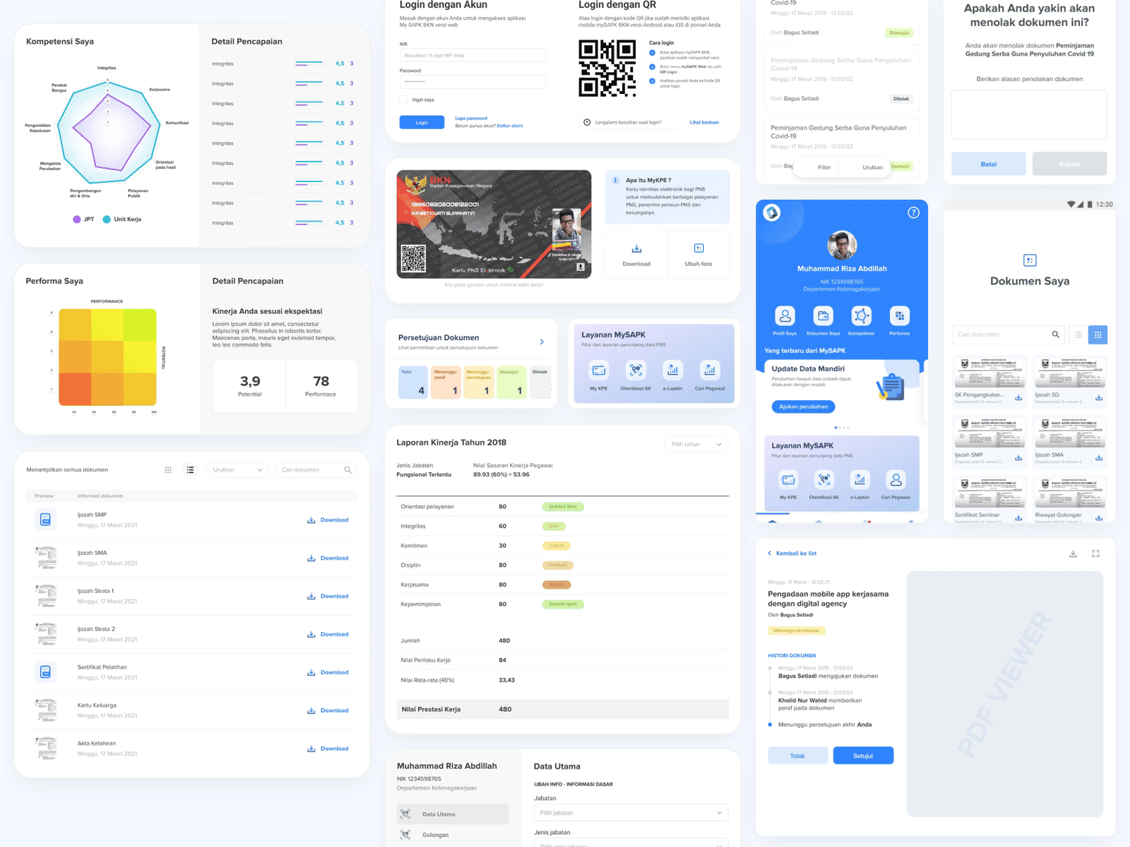
Design to delivery: 14 features, 100+ screens
UIX Engineer: a role that sits between design and delivery. Full ownership of user flows, wireframes, and high-fidelity screens across every feature. On the web platform, every one of those 100+ screens was also built in Vue.js. For Android, the work ended at design specification.
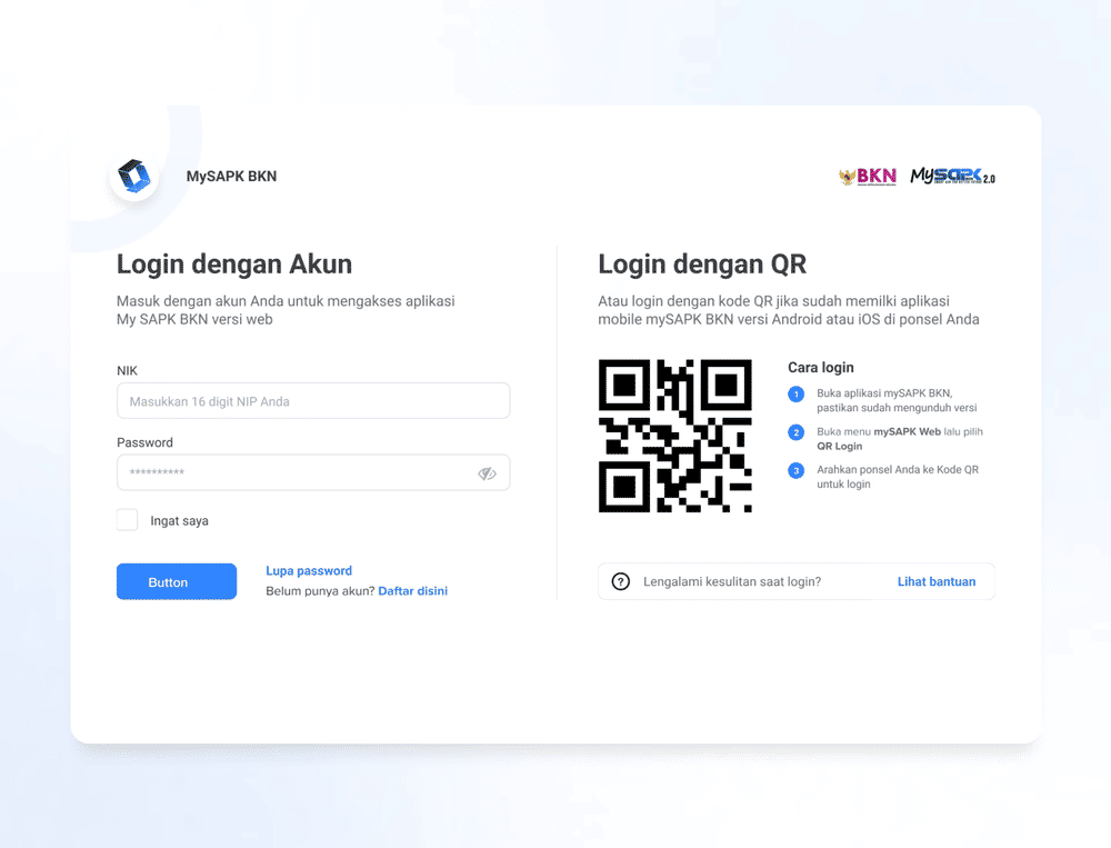
- Authentication: Login, Register, Reset Password
- Dashboard, Dashboard with Event
- User Update Data, Document Submission, All Documents
- Profiles, Stakeholder
- Competency & Performance, Grade Point
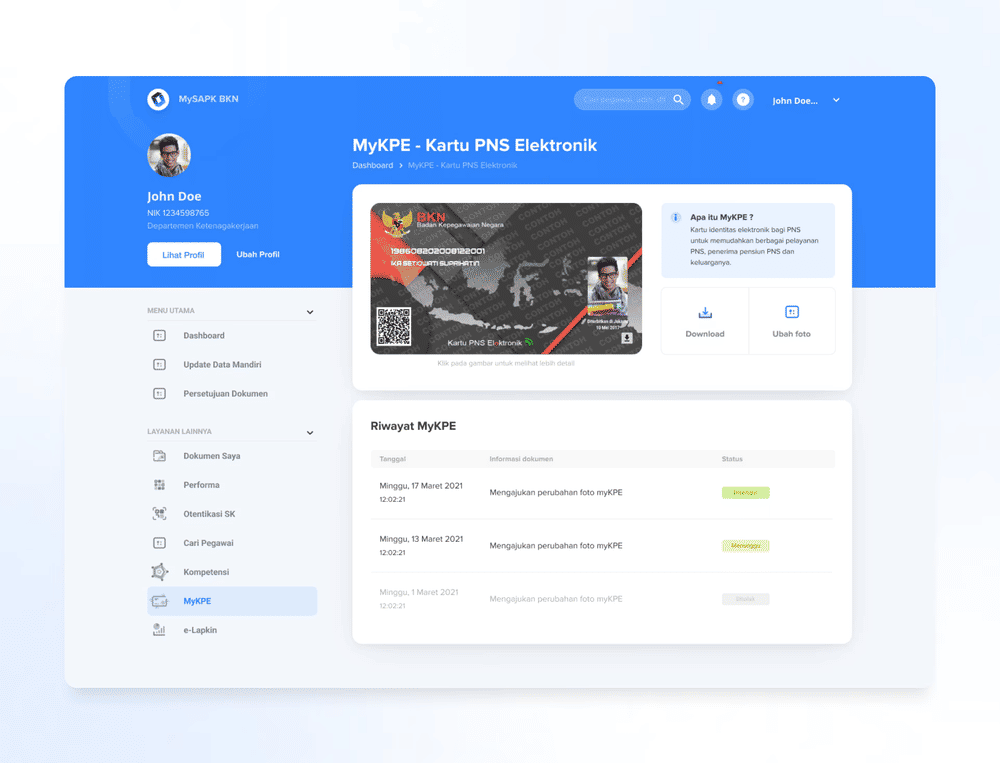
- Kartu PNS Elektronik, Performance Report Yearly
- News, Notification
The data layer doesn't always cooperate
Government systems at this scale run on fixed infrastructure. The backend APIs were either locked or heavily constrained; modifying them was rarely an option, and many didn't return data in shapes that made for clean UI. The real design problem wasn't visual. It was structural.
- Fixed APIs: the UI had to absorb whatever shape the API returned: nulls, unexpected formats, delayed responses.
- Scale pressure: any UX decision affects millions of users across thousands of institutions, many with limited digital literacy or slow connections.
- Two-week delivery: sprint review every two weeks, to design, build, and align with backend and frontend teams inside the same cycle.
The answer wasn't to fight the backend. It was to absorb it: through deliberate loading states, fallback patterns, and micro-UX decisions that users never notice because they never see the seams.
 Full page
 Full page
Component discipline, sprint by sprint
Work ran in two-week sprints. Each cycle closed with a sprint review shared with backend and frontend teams, forcing early alignment on what was designed, what was buildable, and what actually shipped.
Component discipline was the foundation. Every screen was designed against what the API could realistically return. Edge cases (empty states, error states, partial data) were spec'd alongside the happy path, not added later. On the code side, Vue components were kept tightly aligned with the design system, so across 100+ screens the gap between mockup and production stayed small enough to matter.
The design system behind it
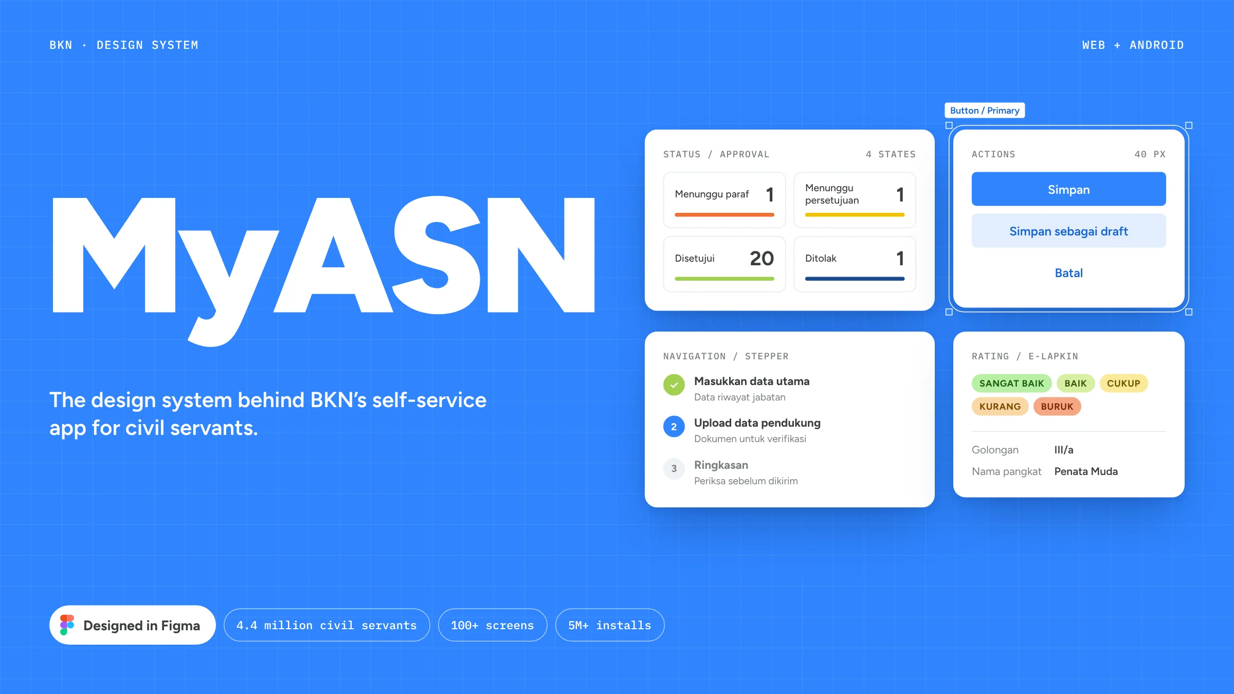
Civil servants use MyASN to keep their own records current, get documents approved and check their performance. One shell and one set of components carry all of it, from a profile form to a nine-box talent grid.
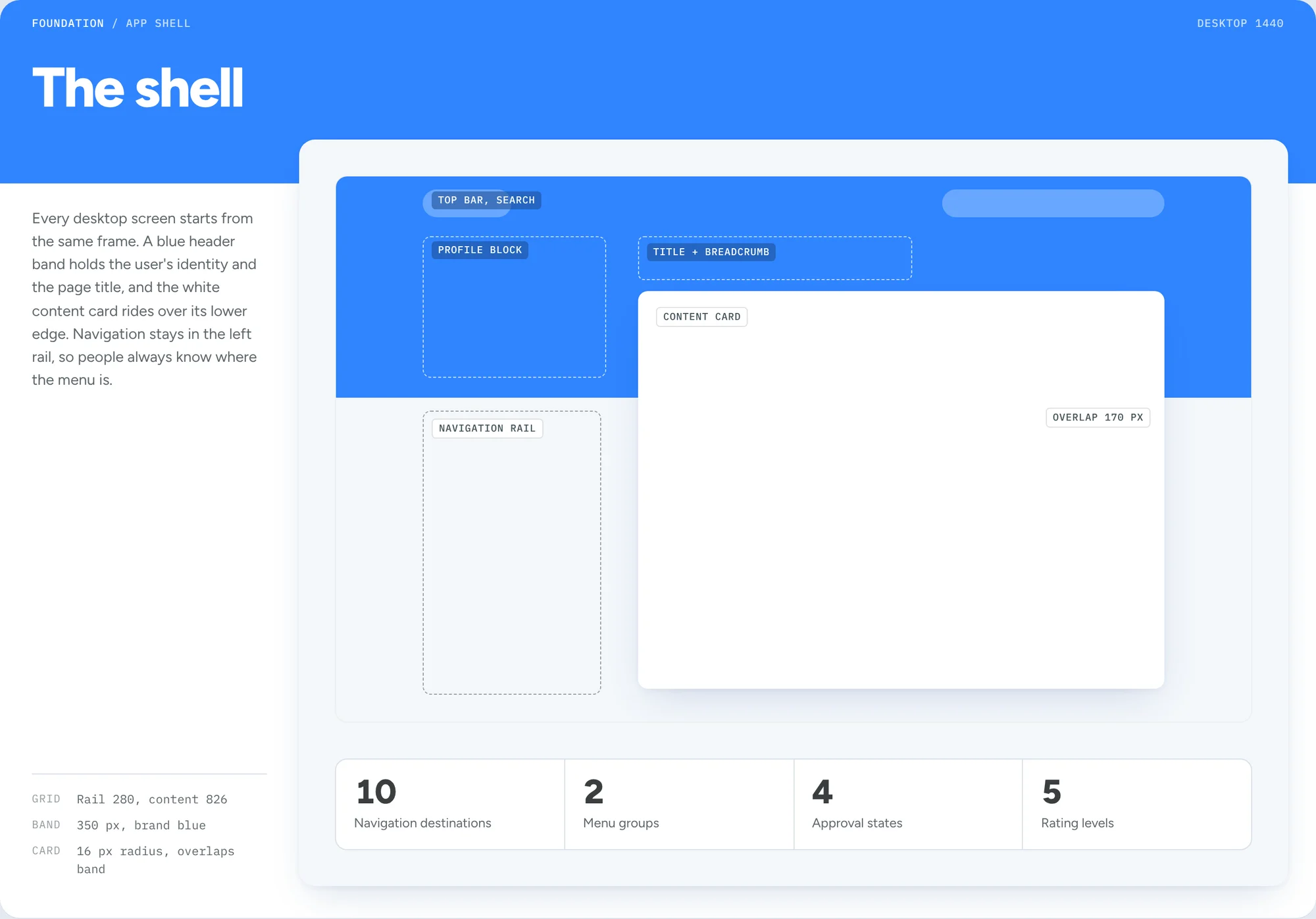
The shell
Every desktop screen starts from the same frame. A blue header band holds the user's identity and the page title, and the white content card overlaps its lower edge. Navigation stays in the left rail, so people always know where the menu is.
 Full page
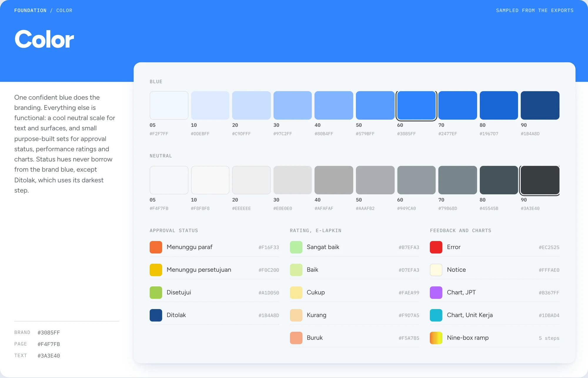
Color
A single blue carries the brand. Everything else is functional: a cool neutral scale for text and surfaces, and small sets for approval status, performance ratings and charts. Status colors never borrow from the brand blue, except Ditolak, which uses its darkest step.
 Full page
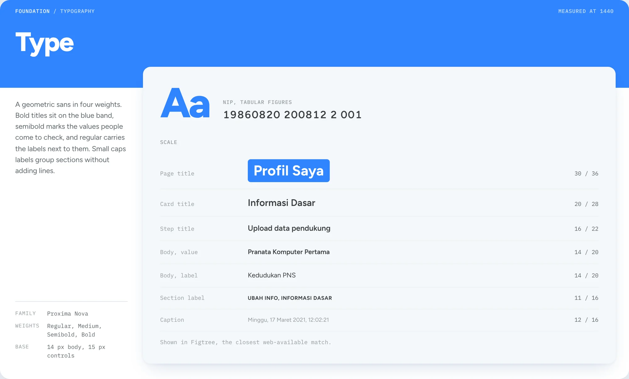
Type
A geometric sans in four weights. Bold titles sit on the blue band, semibold marks the values people come to check, and regular carries the labels next to them. Small caps labels group sections without adding lines.
 Full page
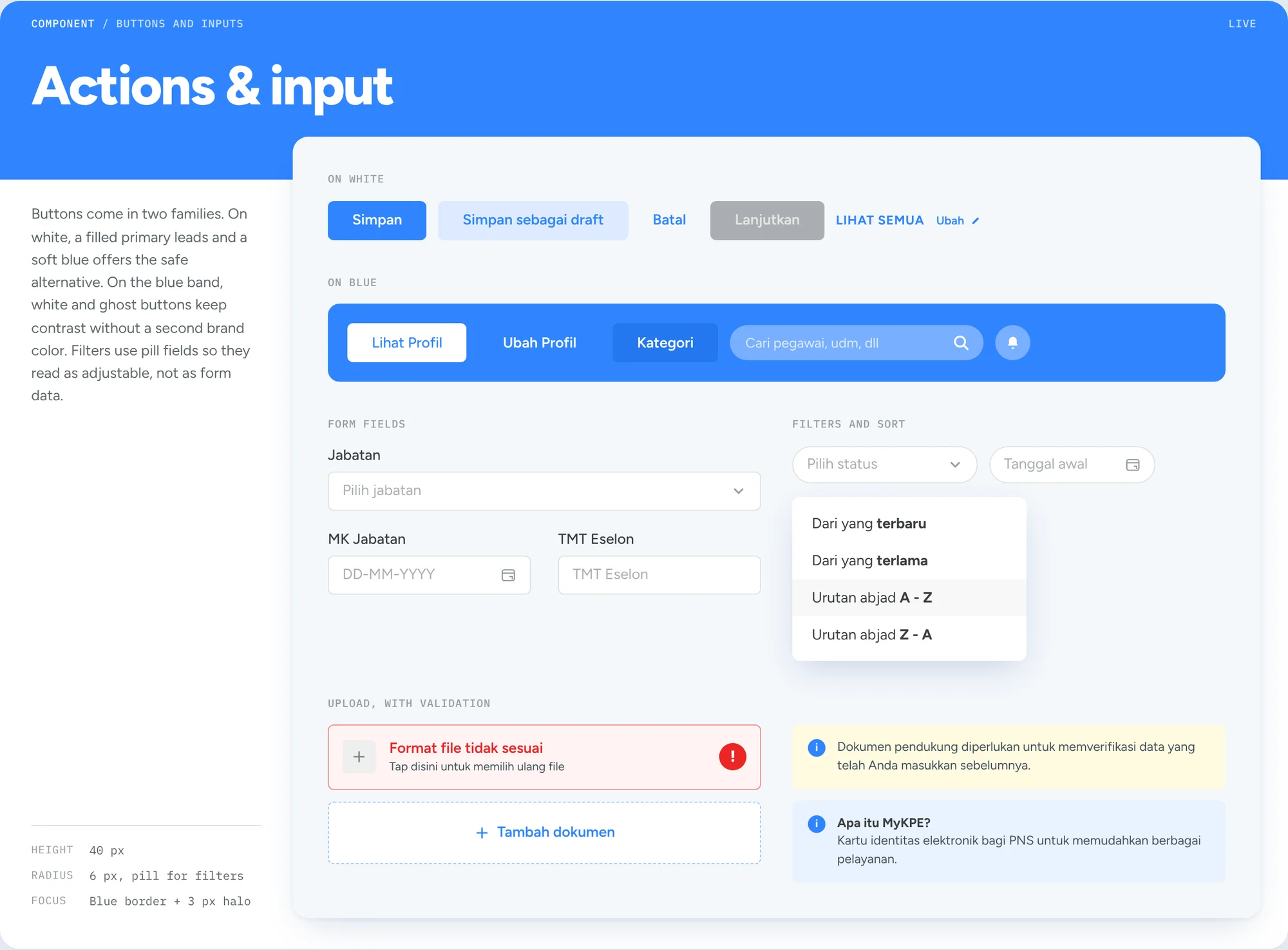
Actions and input
Buttons come in two families. On white, a filled primary leads and a soft blue offers the safe alternative. On the blue band, white and ghost buttons keep contrast without a second brand color. Filters use pill-shaped fields so people read them as adjustable settings.
 Full page
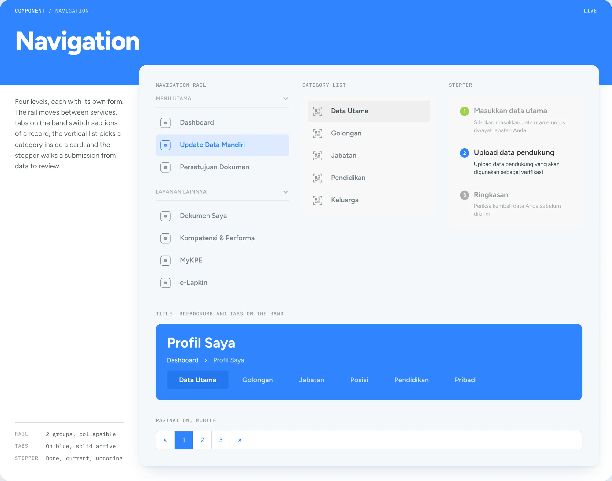
Navigation
Four levels, each with its own form. The rail moves between services, tabs on the band switch sections of a record, the vertical list picks a category inside a card, and the stepper walks a submission from data to review.
 Full page
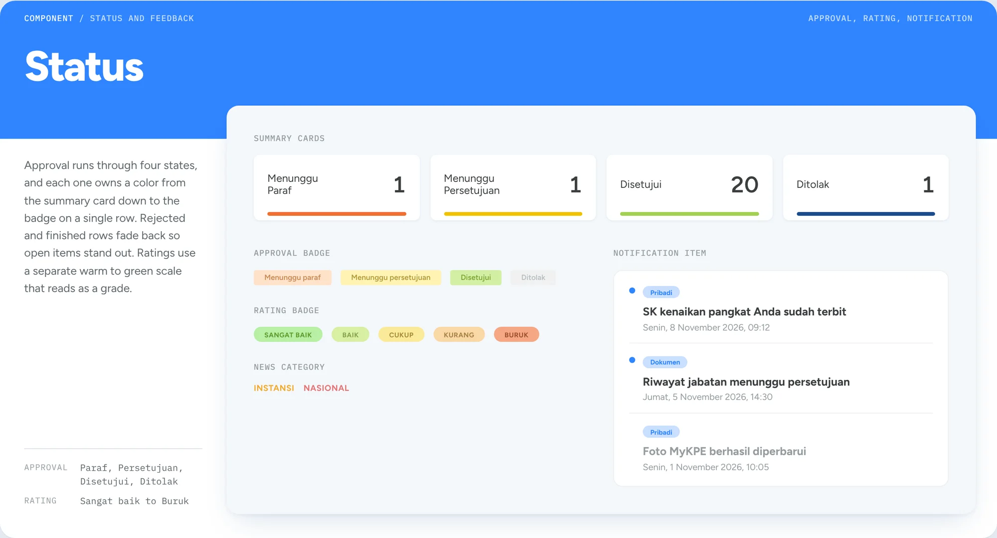
Status
Approval runs through four states, and each one owns a color from the summary card down to the badge on a single row. Rejected and finished rows fade back so open items stand out. Ratings use a separate warm to green scale that reads as a grade.
 Full page
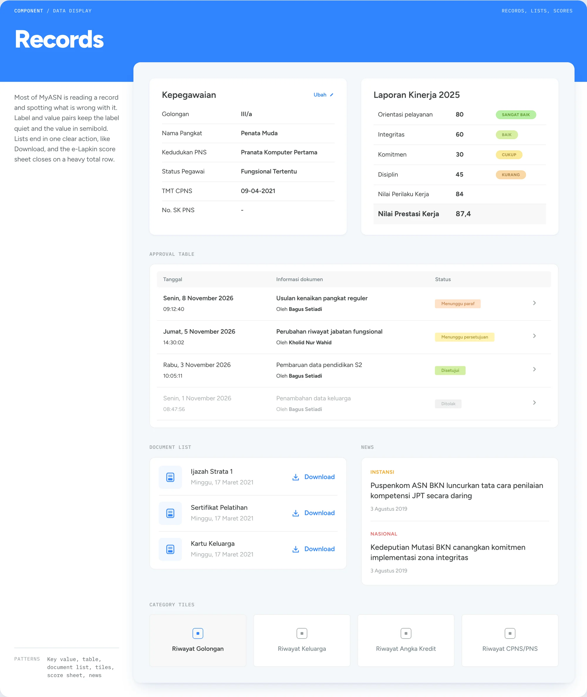
Records
Most of MyASN is reading a record and spotting what is wrong with it. Label and value pairs keep the label quiet and the value in semibold. Lists end in one clear action, like Download, and the e-Lapkin score sheet closes on a heavy total row.
 Full page
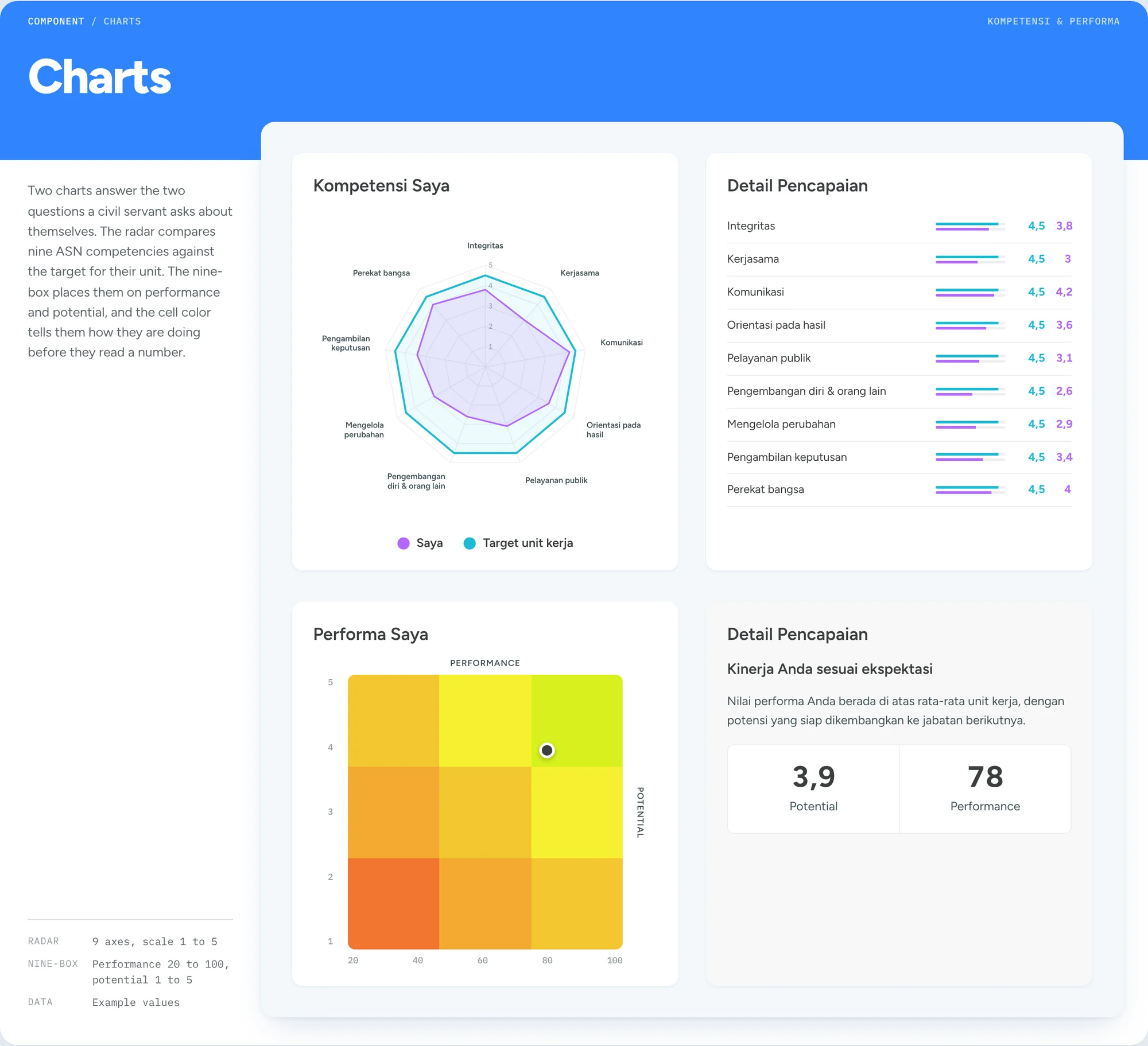
Charts
Two charts answer the two questions a civil servant asks about themselves. The radar compares nine ASN competencies against the target for their unit. The nine-box places them on performance and potential, and the cell color tells them how they are doing before they read a number.
 Full page
Screens
Each screen reuses the shell, the card and the components above, so adding a service means laying out a new card inside the existing frame. Profile data, approvals, documents, performance and the electronic ID card all live in the same frame, so a civil servant only has to learn MyASN once.
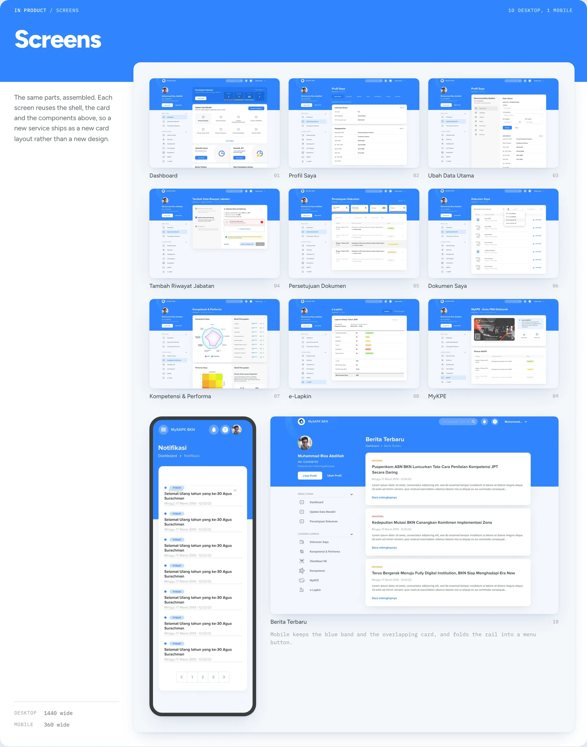 Full page
The experience held
MyASN BKN is in active use by civil servants across Indonesia, available on web and Android.
- 5M+ installs on the Play Store
- 4-star rating from 18,500+ reviews
- 100+ screens designed and built
A four-star rating for a government HR platform used under compliance pressure across thousands of institutions. Most of the low reviews are about server load during peak submission windows, not the UX.
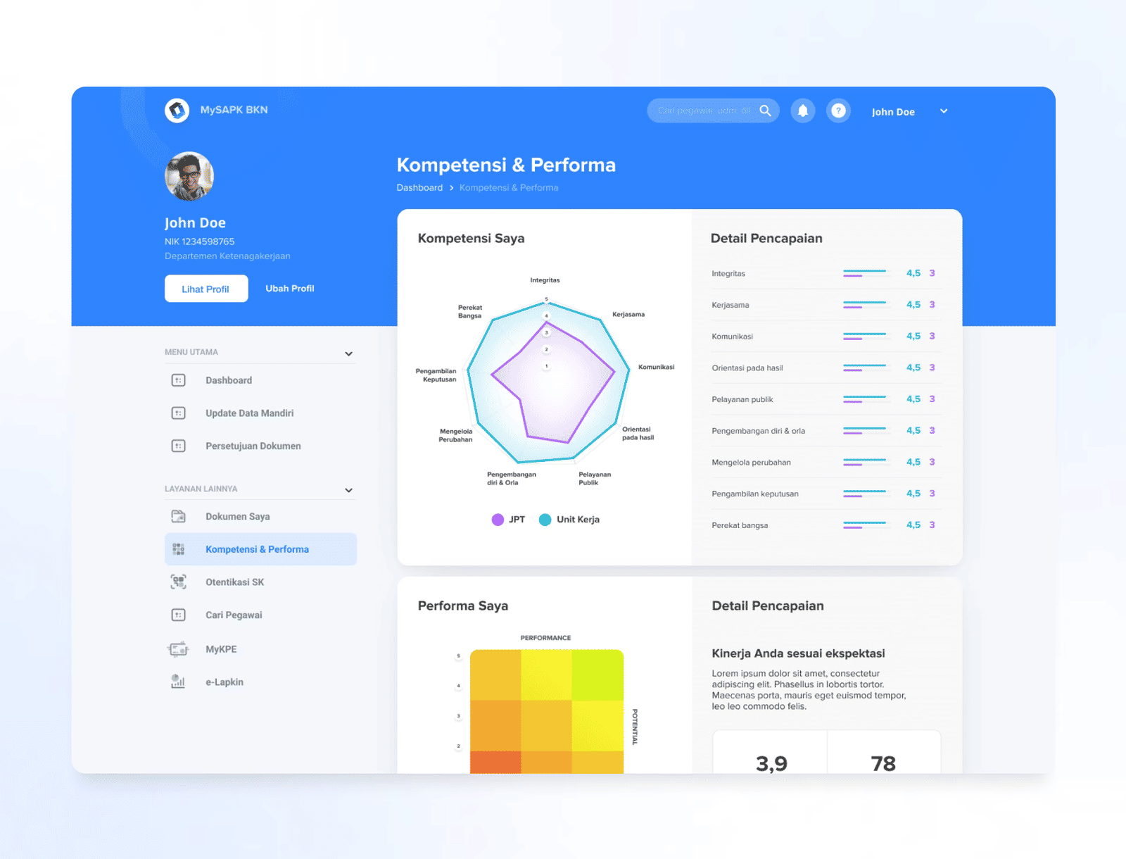 Full page