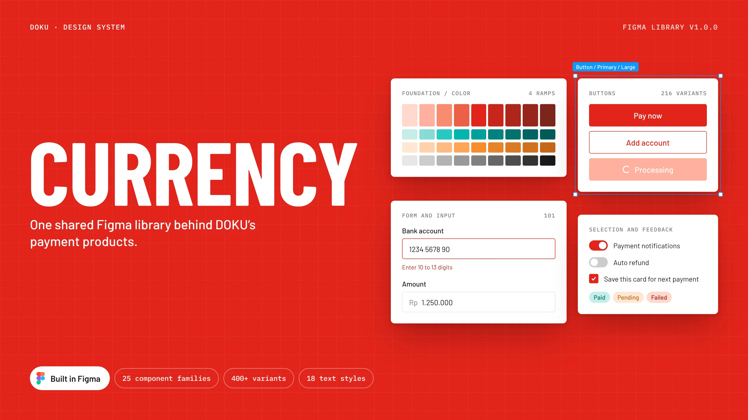
Currency
One shared Figma library behind DOKU's payment products.
 Full page
- Role
- Product designer
- Timeline
- 2019 to 2023
- Scope
- Foundations and 25 component families
- Tool
- Figma, variants and styles
The library starts with brand color, type and elevation. On top of those sit the 25 component families that DOKU's dashboards, checkout and merchant tools are built from.
What the library holds
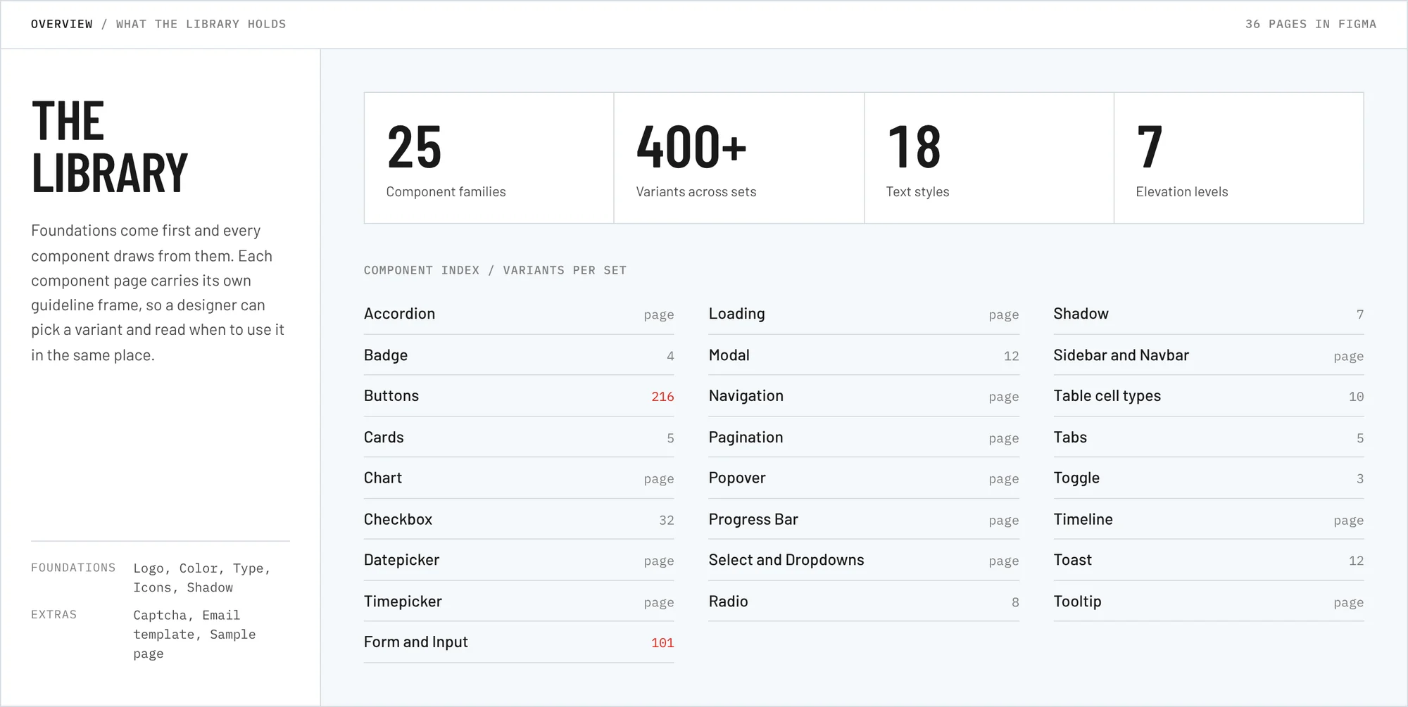
Foundations come first and every component draws from them. Each component page carries its own guideline frame, so a designer can pick a variant and read when to use it in the same place.
- 36 pages in Figma
- 25 component families
- 400+ variants across sets
- 18 text styles
- 7 elevation levels
 Full page
Color
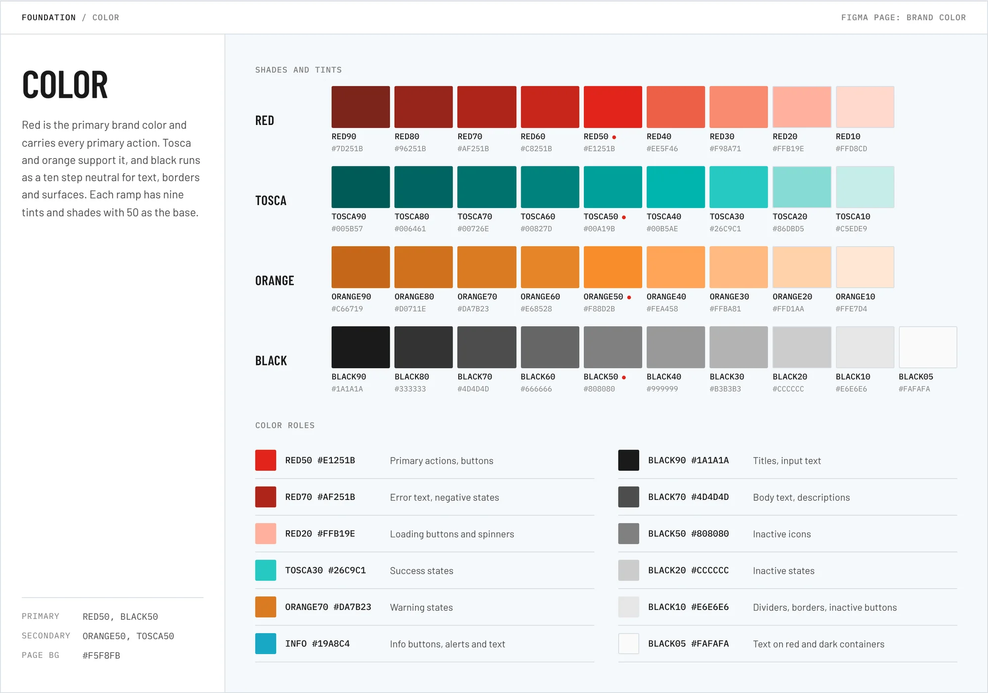
Red is the primary brand color and carries every primary action. Tosca and orange support it, and black runs as a ten step neutral for text, borders and surfaces. Each ramp has nine tints and shades with 50 as the base.
 Full page
Type
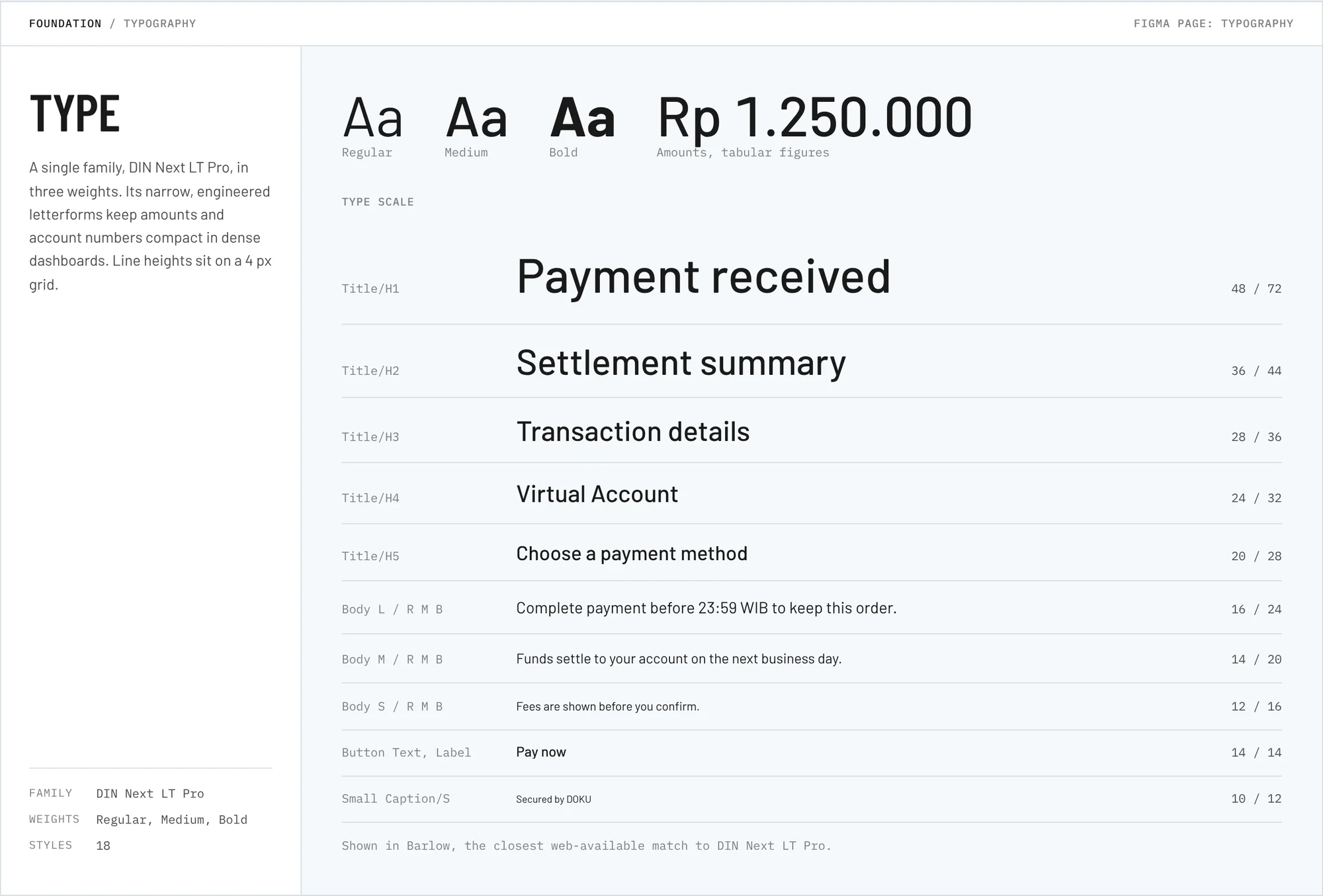
A single family, DIN Next LT Pro, in three weights. Its narrow letterforms keep amounts and account numbers compact in dense dashboards. Line heights sit on a 4 px grid.
 Full page
Elevation
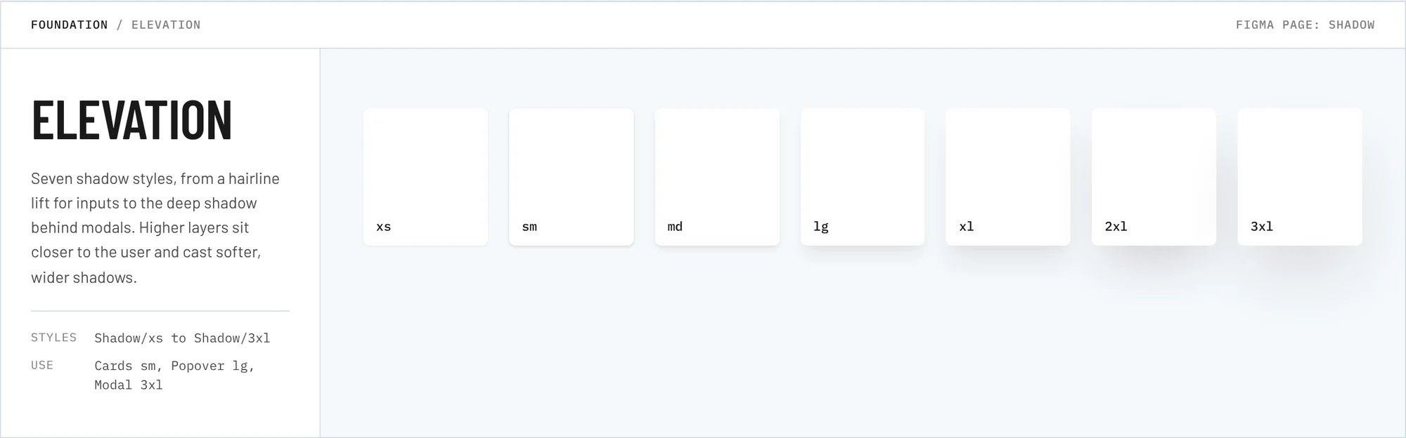
Seven shadow styles, from a hairline lift for inputs to the deep shadow behind modals. Higher layers sit closer to the user and cast softer, wider shadows.
 Full page
Buttons
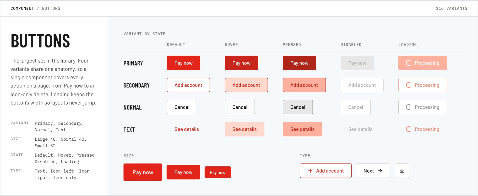
The largest set in the library, with 216 variants. Four variants share one anatomy, so a single component covers every action on a page, from Pay now to an icon-only delete. In the loading state the button keeps its width, so nothing around it shifts while a payment is processing.
 Full page
Form and input
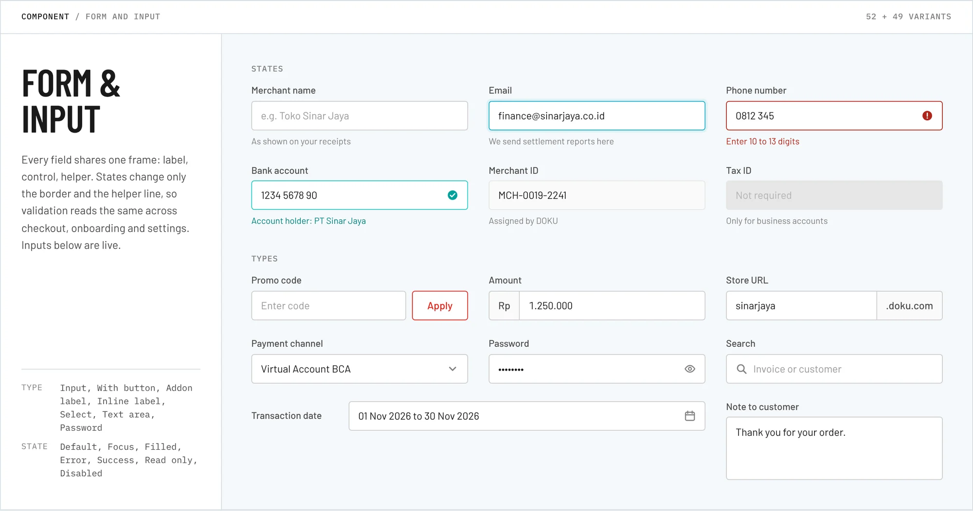
Every field shares one frame: label, control, helper. States change only the border and the helper line, so validation reads the same across checkout, onboarding and settings.
 Full page
Selection
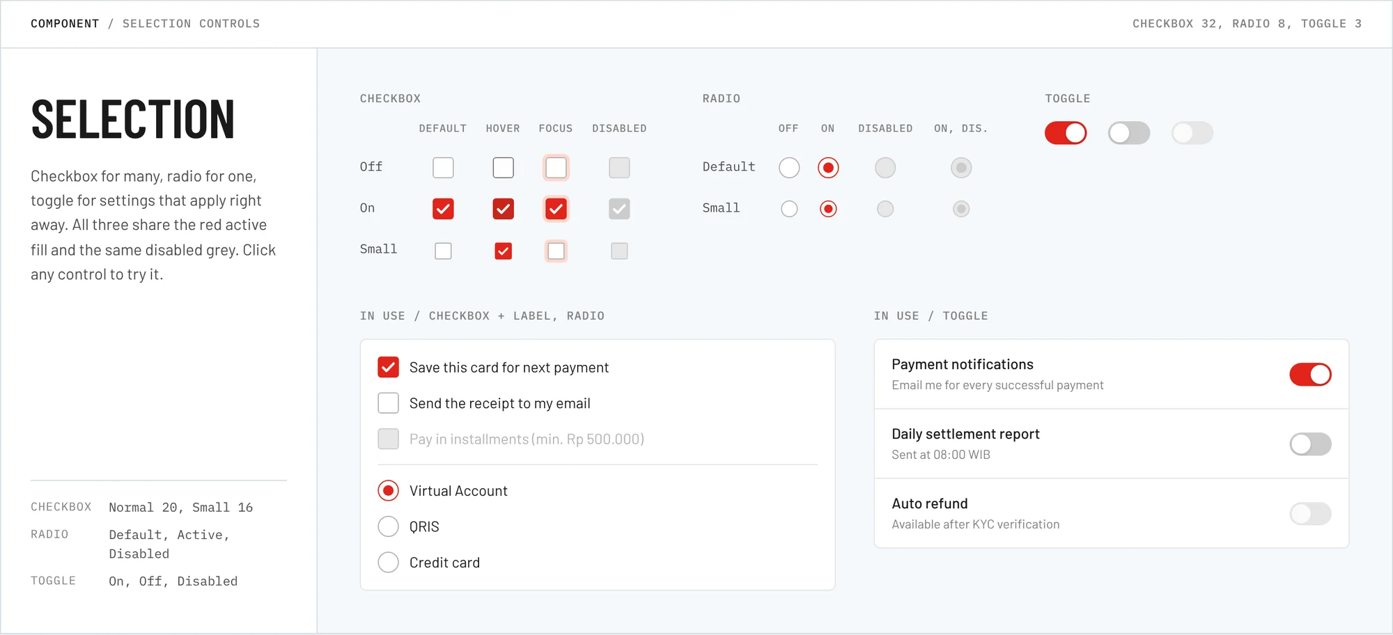
Checkbox for many, radio for one, toggle for settings that apply right away. All three share the red active fill and the same disabled grey.
 Full page
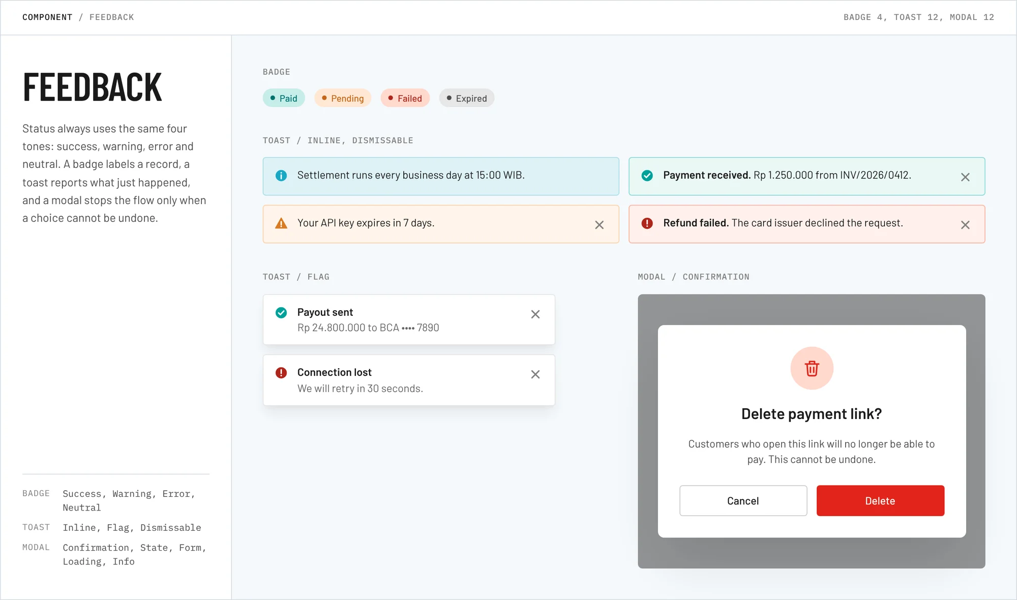
Feedback
Status always uses the same four tones: success, warning, error and neutral. A badge labels a record, a toast reports what just happened, and a modal stops the flow only when a choice cannot be undone.
 Full page
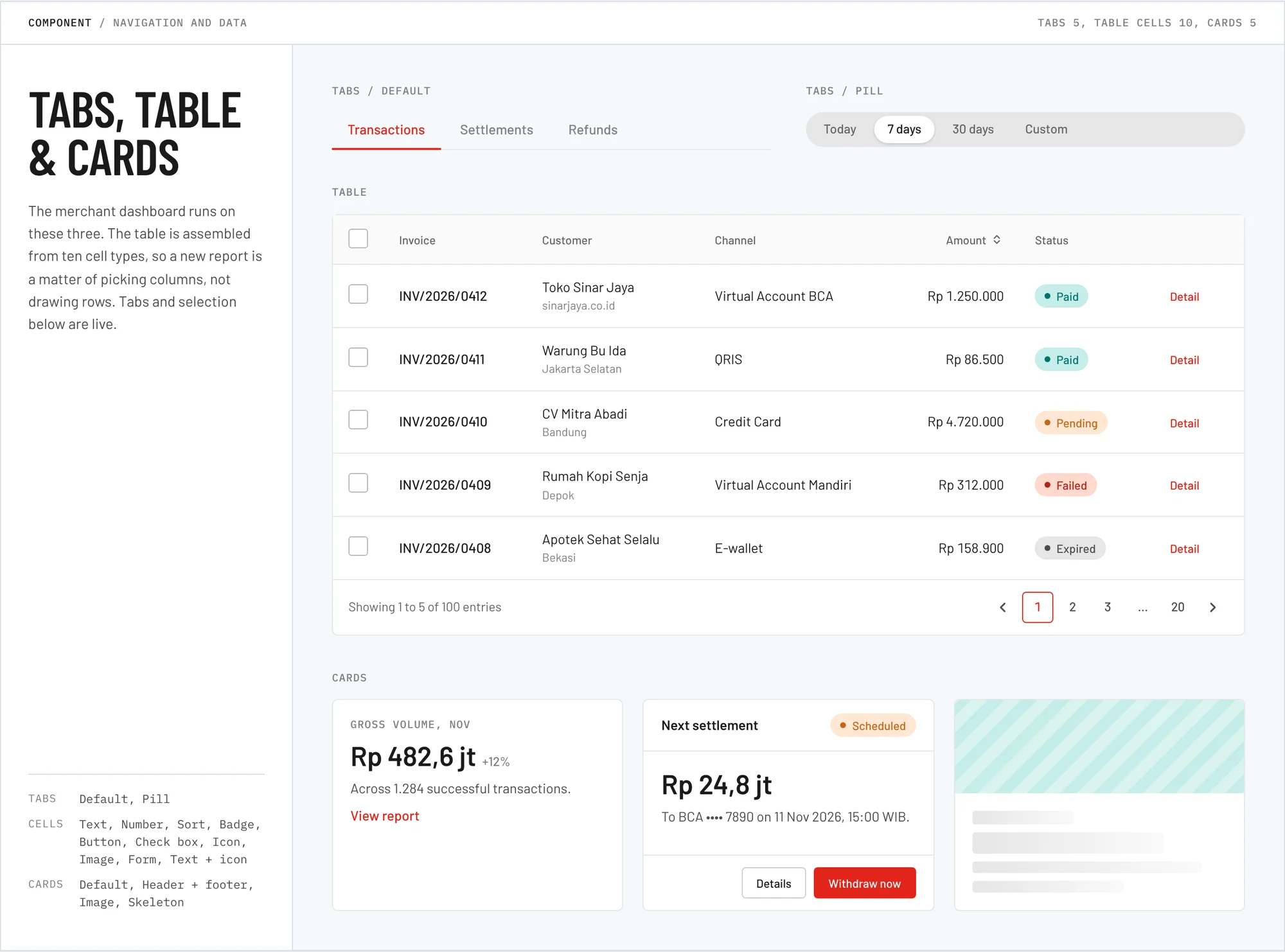
Tabs, table and cards
The merchant dashboard runs on these three. The table is assembled from ten cell types, so a new report is built by choosing the columns it needs.
 Full page
Where the library is used
Foundations feed the components, and the components feed checkout, the merchant dashboard and internal tools. Changing a foundation such as RED50 or Body M updates every file that uses it.